
Case study: how many new people does each coronavirus patient infect?
Gordon Bower
02 May 2020
Introduction
Stopping the spread of an epidemic fundamentally comes down to one thing: the basic reproduction number, Ro. If each contagious person infects more than one healthy person on average, the number of infected people grows exponentially (until a large fraction of the population is infected; then the growth becomes logistic.) If each contagious person infects an average of less than one healthy person, the spread of the disease grinds to a halt. How quickly it halts is a function of the disease's incubation period and how much lower than one that average gets.
This number doesn't remain constant. It is different for each disease, and for a single disease, it depends on how closely packed people are, on how much they interact with each other, on how hard they try to self-isolate when they learn they have been infected, and a host of other things. In an urban setting, given 2019 behavioral norms, the novel coronavirus's R tends to be quite high. (Exactly how high is a matter of some dispute; it is hard to measure directly, especially when availability of testing is a significant obstacle. I tend to agree with Sanche et al. whose best guess for Ro before any intervention is 5.7, with uncertainty bounds from 3.8 to 8.9. Other earlier authors argued for a lower figure around 2.) To emphasize how it changes as conditions change over time, it is sometimes called Rt (R changing with time), or for the lazy or HTML-challenged, just R.
In the USA, the novel coronavirus spread essentially unchecked until late the second week of March, at which time states started taking steps such as shutting down schools and cancelling sporting events and conferences. Over the next two weeks, more and more restrictions were placed on business, travel, and recreation, until by the end of March, most states instructed all people not working in "essential industries" (health care, food distribution, transportation infrastructure) to remain at home as much as possible. People were initially compliant, but with just a few weeks, started clamoring to be released from these restrictions. These restrictions started to be eased as early as 21 April in Alaska and 25 April in Montana, and in many other states at the end of April.
The March-April shutdowns varied in effectiveness. In Montana the spread of the disease was almost completely halted. In Louisiana an initially-severe outbreak was brought under control remarkably rapidly. New York avoided overwhelming its hospitals, just barely, but the number of cases tapered very gradually. In states like Colorado, Illinois, and New Jersey, the number of new cases per day appears to be remaining roughly constant rather than increasing exponentially, but not slowing down. Common sense suggests those states make further efforts to minimize exposure, rather than even think about wholesale reopening.
The questions at hand:
- What was R before intervention?
- What was R reduced to in each state by the interventions in place from late March to late April?
- How much, if any, can the restrictions in place in April be relaxed without causing R to increase above 1?
In all fairness, the third is really completely beyond our scope; and we will approach the first two only by making some big simplifying assumptions. (Remember, I am approaching this as a statistician and mathematical modeller, not an epidemologist.)
Building our mathematical model
We will keep things as simple as we can: we are going to consider only the number of confirmed cases in each state as a function of time. Yes, in the early stages of the epidemic, this is a very incomplete count because so few tests were available. We know our results from April will be of higher quality than our results from March. I used the cumulative number of cases by county and day as provided by Johns Hopkins, aggregated county data to get state totals, and subtracted adjacent-date cumulative numbers to get number of new cases per day.
How many new cases do we expect on a given day? That depends on the incubation time of the disease, on how many people were contagious at that previous time, and on R. Our basic model will be
y(t) = R * x(t'), whereThe problem is, x isn't a number we can just look up. We can guess what it is, by looking at how many new cases there were several days ago. Lauer et al. reported a median time from exposure to onset of symptoms of 5.1 days. The mean time is somewhat higher: the shortest incubation times are still 3 or 4 days, but the longest can be two weeks. People also can become contagious a day or two before they have symptoms. They may remain contagious for several days afterward — but we assume that almost everyone with symptoms self-isolates as best he can soon after becoming symptomatic. Family members and medical care providers may still be exposed in the days after he becomes symptomatic.
- y is the number of new cases at time t;
- x is the number of people who were contagious one incubation period ago;
- R of course is the reproduction number we talked about in the introduction.
We also can't just look up how many days apart t and t' are; it's not the same for every transmission. For simplicity, I took the average of the number of new cases 4, 5, 6, 7, and 8 days ago as my estimate for how many people were contagious at the right time to cause new cases "today." A more complicated weighted average would be more accurate (a low weight to day 3, a high weight around days 4, 5, and 6, and progressively lower weights out to 10 to 14 days ago), but our results won't be too sensitive to exactly how we estimate x.
Being a statistician, I know that y won't exactly equal R times x: I would call Rx the expected number of new infections, and expect the actual y be approximately Poisson-distributed with mean Rx.
Given a bunch of (x,y) pairs from a time period during which we believe R was constant, we use that set of observations to estimate R and place uncertainty bounds on our estimate. There's a whole subfield of model fitting, Poisson regression, devoted to fitting this type of model.
But there is a computationally much simpler way that is almost as good: find the straight line, going through (0,0), that lies as close as possible to most of our (x,y) pairs. This is "ratio regression", a special case of linear regression. )Actually we regress sqrt(y) against sqrt(x), because linear regression requires homoscedasticity, uniformity of variance, and the standard deviation of a Poisson-distributed random variable increases in proportion to the square root of its expected value. But all the graphs below will show x, y, and R to keep it simple for the layman.)
As a sanity check, I will also try a second method of finding R: we can avoid estimating x entirely by observing that y should grow, or shrink, exponentially with time:
y(t) = exp ( - k t), whereThis model is also easy to fit with simple statistics software: it's a simple linear regression of log(y) against the date. (Transformations of this type are termed "quasilinear regressions.") This is easy to compute, plot, and understand, and has the merit of not relying on how good my guesses at
k is log(R) divided by the mean incubation time — which we've assumed was about 6 days in the ratio-regression model.
I fit both of these models, to data from all 50 states, for the period April 8-28. Why those dates? Almost every state issued its stay-at-home order by the end of March, and my home state of Montana started to reopen on April 25th. By looking only at people who tested positive at least 8 days after the stay-at-home order, and less than 4 days after the reopening, I am looking at a period where the same restrictions were imposed on the population for that whole three-week period.
The period before March 20th is also of interest, since in most states that was a time of unchecked spread of the disease, with school closures and other restrictions taking effect the week of March 16th. We can use this time period to calculate what R was before any restrictions were imposed (but we'll have to take those estimates with a grain of salt because we know testing wasn't very complete yet.)
During the latter half of March, new closure orders happening on a daily basis, where we cannot assume R is constant. We refer to these three time intervals as early (March 1-20), transitional (21 March - 07 April), and late in the graphs below.
Results: April 8th to 28th
You heard a lot about "flattening the curve" on the news in March and April. Most of the graphs you saw on the news and on sites like Domo's tracker are cumulative numbers of cases. This type of graph curves upward during the exponential growth phase, becomes a straight line ("flattens") when R=1, and levels off as R falls below 1.
A state's worst day for new cases and new hospitalizations is typically right around the time R reaches 1. How long it takes for the caseload to diminish depends how far below 1 R goes. If R=0.8, it takes about two weeks for the rate to be cut in half; if R=0.6, about one week.
We have been very fortunate in Montana: the virus was only just getting started here in mid-March when we started imposing restrictions, and a month of restrictions has almost completely halted the virus. But New York is still getting thousands of new cases per day despite their best efforts at distancing.
My modeling (via the ratio regression approach) shows just 10 states where I am confident the pandemic is solidly under control (that is, where my entire 95% confidence interval for R is below 1.) From best to worst, these are Hawaii (the only one under 0.5); Vermont; Montana; Idaho; Louisiana (these four between 0.5 and 0.6); Alaska, Washington; Michigan; Florida; and New York. It is probably well controlled in Wyoming, West Virginia, and Maine — small sample sizes make the error bounds on my estimates wider in these states, even though my best guess at R is that it is lower there than in Florida and New York.
On the other hand, my modeling shows that the pandemic is currently uncontrolled — still rising exponentially — in Illinois, Virginia, Minnesota, Iowa, and Nebraska. It is quite likely uncontrolled in several additional states: Kansas, North Dakota, Maryland, Rhode Island, Massachuetts, Mississippi, and North Carolina. The bulk of the rest of the country is somewhere in between, too close to call.
Fitting an exponential curve directly to the number of cases produced the same results in most of the above-named states. Indeed this method said was even more pessimistic, showing R was significantly above 1 in 14 states, and significantly below it in only 8.
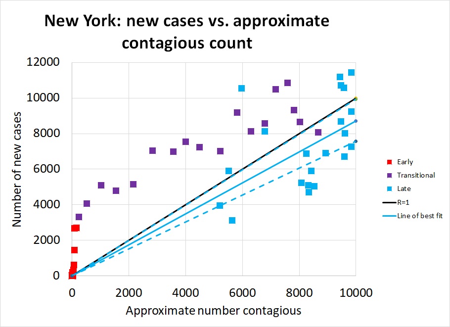
Now (finally!) we will look at what we learn by plotting y against x, for four representative states. The graph at right, showing new cases in New York from early March through late April, is a beautiful illustration of how R has changed with time. The earliest points, in red on the graph, rise so steeply they seem to be climbing vertically. In mid March, R in New York state was huge, with the number of new cases rising from a few hundred to a few thousand in a single week. As restrictions took effect in late March, the number of cases continued to rise, but R declined: see how the purple points move rightward, not just upward, on the graph. Finally in April, the number of new cases just barely came under control: the solid black diagonal line marks R=1, the boundary between Good (lower right) and Bad (upper right), and most of the blue points from April lie below this line. Our best estimate is that R=0.87 during this time (95% confidence interval 0.75 to 0.99)
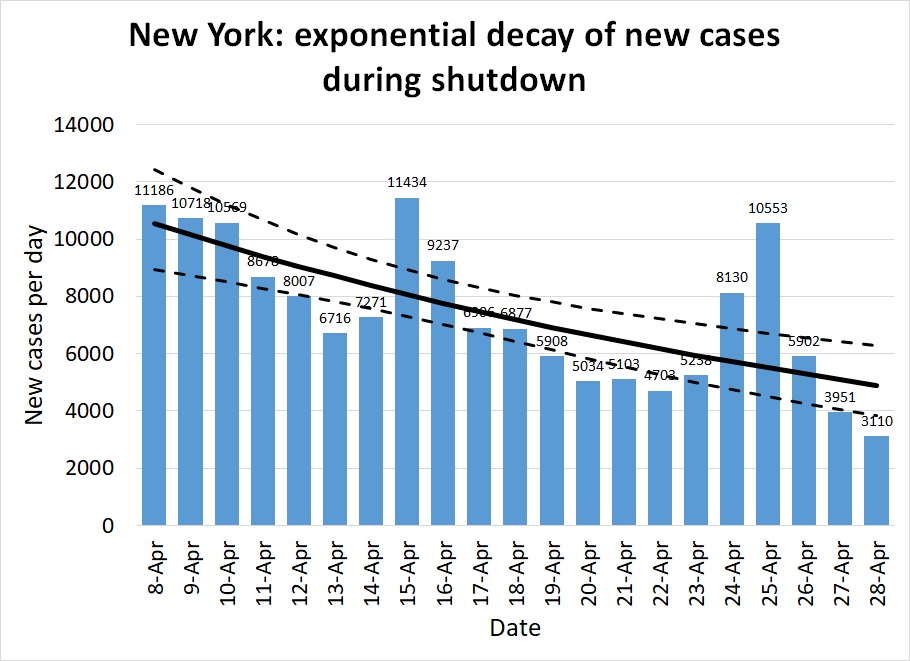

The second and third graphs illustrate the alternative method of plotting the number of new cases against time and looking for an exponential trend. Figure 2 is plotted on a linear scale, showing the gradual slowing of the pandemic's pace through April from nearly 10,000 cases a day to under 5,000. If the same measures are continued into May, we can hope to see only 2,000 new cases my about May 10th, and fewer than 1,000 by Memorial Day. The quasilinear regression approach produced a best estimate of R=.79 (95% confidence interval 0.71-0.89.) Note that we don't expect the two methods to produce exactly the same estimate, but we do expect the confidence intervals to overlap substantially — and they do.
Figure 3 is the same data as Figure 2, plotted on a logarithmic scale. On a log scale, an exponential trend appears as a straight line -- in this case, a straight line sloping very, very slowly downwards, suggesting there will be a significant number of cases in New York for many months to come. The log scale is less familiar to a general audience, and tends to make trends look less dramatic, so you won't see it on the evening news much. But it's useful for assessing the quality of a model: if the data look like they are doing something other than following a linear rise or fall on a log-scale graph, it means exponential growth or decay isn't a good model.
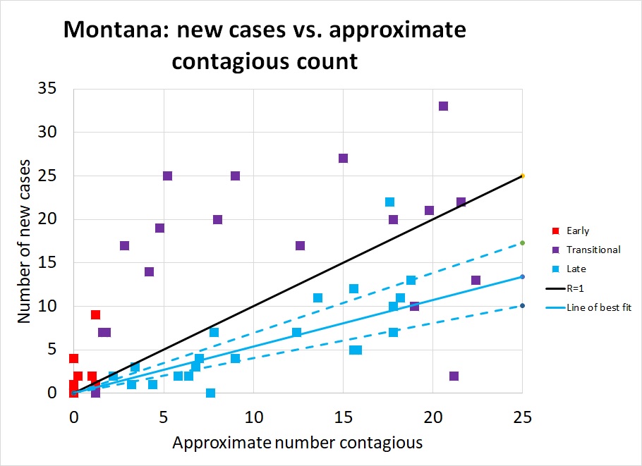
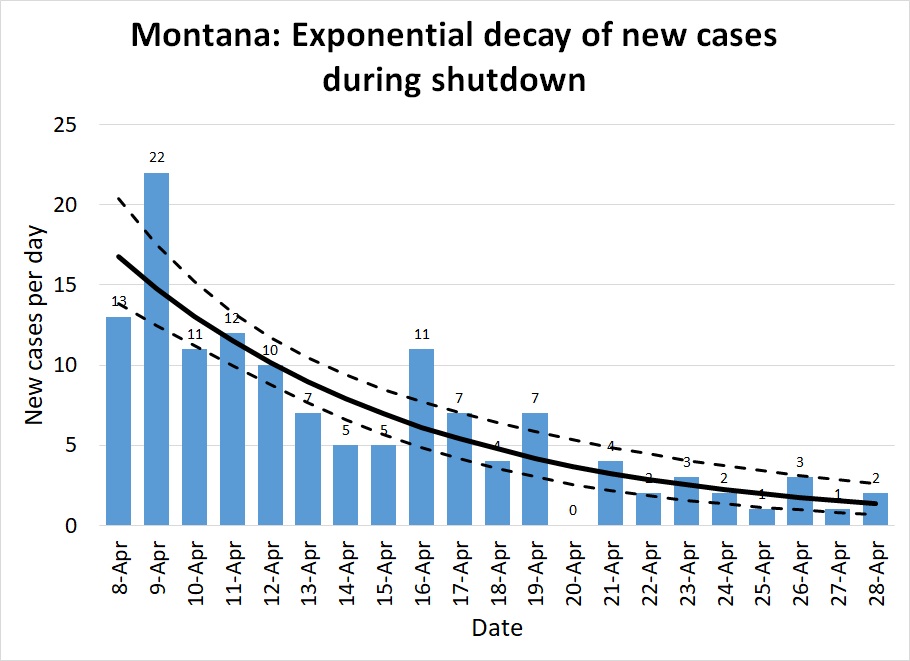
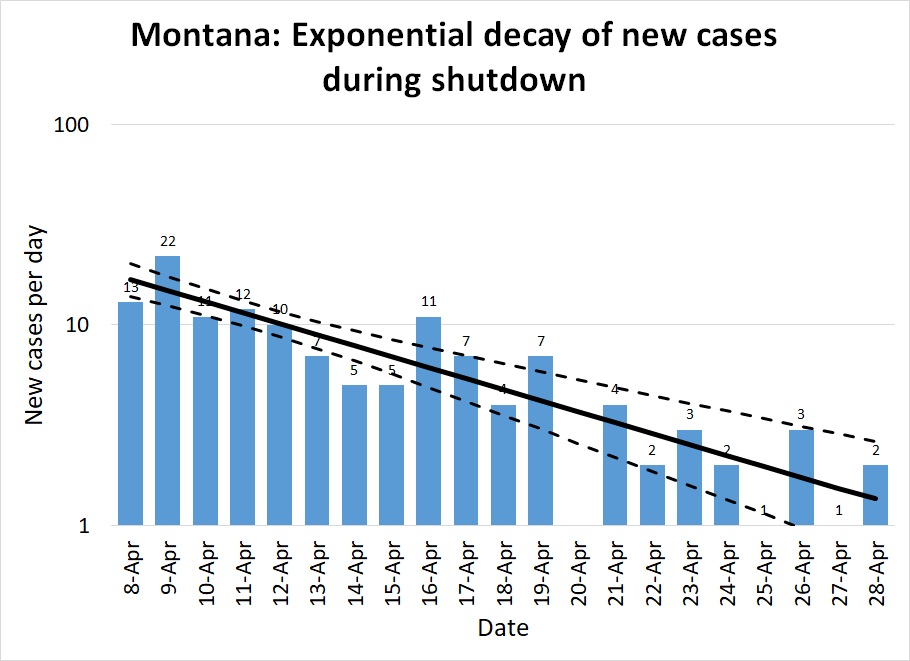
Montana: As I mentioned above, Montana was fortunate; the pandemic was only just beginning to pick up the pace when the shelter in place order went into effect, so the state had only one week of more than 10 new cases per day. In Figure 4, note the same general pattern as in Figure 1: early unchecked growth at high R, a gradual lowering of R as distancing measures take effect, and R consistently well below 1.
The lower population density of Montana meant that R was probably always lower here than in New York: most people commute to work by private car, not in a packed subway, for instance. As distancing measures took effect it was possible for many Montanans to exercise outdoors without coming into close contact with a single other person. Small-town grocery stores were able to do things like allow only 10 customers at a store at a time, and disinfect the shopping carts between each batch of ten. Our ratio regression model calculates R=0.53 (.40-.69); the quasilinear regression model calculates R=0.47 (.37-.59). The exponential decay is spectacularly visible in Figure 5, and the way plotting on a log scale turns this into a straight line is very clear in Figure 6.
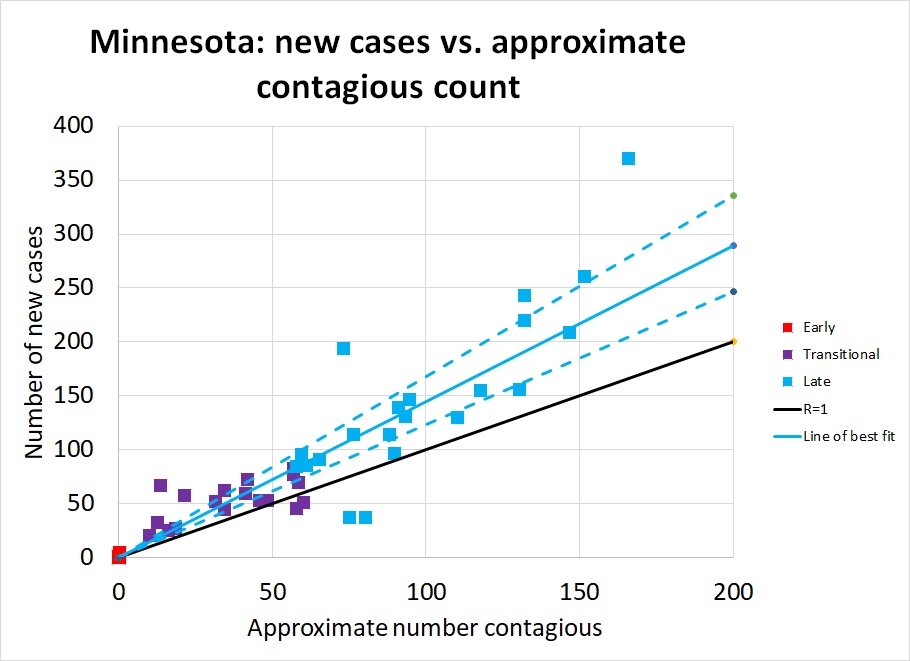
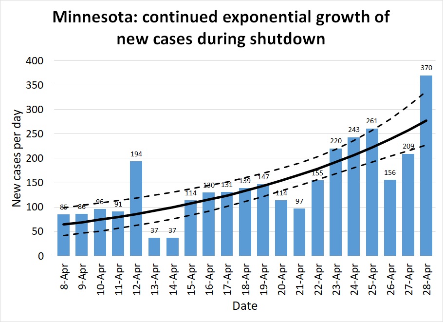
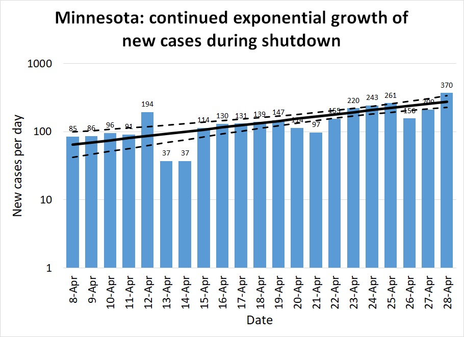
Minnesota: Minnesota illustrates the opposite extreme. Their number of new cases per day (and their hospitalizations, ICU utilizations, and number of deaths, as shown on IHME's graphs), have continued to rise at a modest pace. Until about April 20th it was possible to hold out hope their number of cases had leveled and they had achieved R=1. Perhaps, statewide, they have; but a major outbreak at a pork processing plant elevated the number of cases again. This is a limitation of assuming R is constant across an entire state. In fact it varies across counties and industries. Those essential industries that remained open while the rest of the economy was shut down face a higher risk. If the pandemic comes under control among the rest of the population, cases among essential workers will come to make up the majority of the new cases statewide.
The five right-most points on Figure 7 are from the last days of the month after the pork plant outbreak. But note that even before that date, Minnesota never consistently achieved R≤1. The pork plant outbreak may just be one symptom of a more systemic problem. There is enough hospital capacity that Minnesotans have a few weeks to find a solution before they are overwhelmed. But I hope they are taking some kind of positive action to further reduce R.
The ratio regression model estimates R=1.45 (1.23-1.68), and the quasilinear regression model estimates R=1.54 (1.31-1.83).
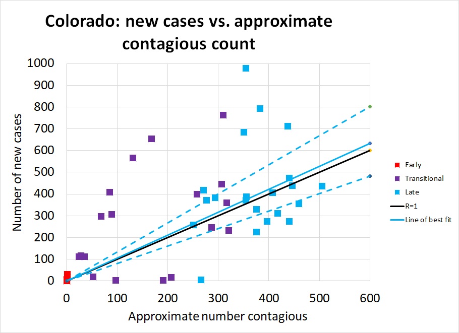
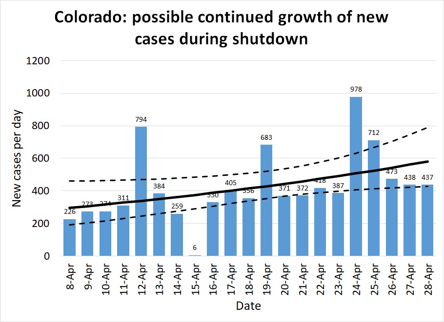
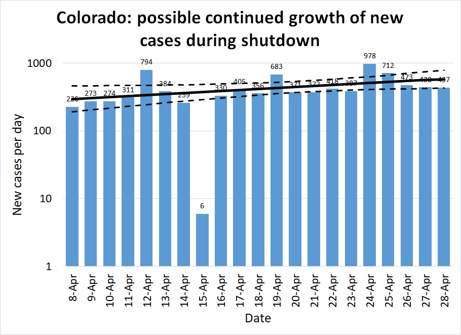
Colorado: States like Colorado, Georgia, and Illinois are the ones that face the most critical decisions in early May. These are states that have managed to hold the number of cases per day to a manageable level, but have not succeeded in achieving a New York-like steady decline in caseload. These are states that haven't gained any breathing room from the past month and remain perched on the knife-edge of disaster if they give in to pressure to relax distancing measures.
Figures 10-12 show how Colorado has suffered about 400 cases per day throughout all of April. As in other states, the red and purple dots in Figure 10 show how much improvement was achieved in March, bringing R down to 1 but not managing to hold it below it (the blue dots are scattered about equally on both sides of the black R=1 line.)
Other states: a complete list of my estimated R for every state, by both regression methods, can be seen here.Results: before March 20th
This section is still incomplete — it is taking a bit of time to separate out which large Rs are likely to be real from those caused by rapid increases in quality of testing, by very small data sets for states that only had their first cases in mid-March, and the issue of underestimating x because many of these early infections were the result of out-of-state travelers returning, not exposure to local contagious people.
Watch for an update later in May, proposing R potentially as high as 13 is heavily urban places like New York, and intensely localized clusters like Idaho's cluster of cases in Sun Valley. Almost all states show R≥2 and the median R on my raw list is around 6.
Implications for May and beyond
Knowing what R is in your community right now is how you know how much, if any, you can relax local restrictions while keeping the pandemic under control. It has to be kept below 1. That means that states like Alaska and Montana can be thinking about moderately higher levels of human interaction. It means places like Colorado and Illinois need to be thinking about how to reduce interaction, not allow more of it. It means everywhere needs to be prepared to not "fully reopen" for a very long time.
That doesn't mean we "have to keep everything shut down." We have choices to make about what interactions are necessary, and what interactions can be minimized.
Back in mid-March, Tomas Pueyo's article The Hammer and the Dance attracted a lot of press attention. Towards the end of that article, he proposed that if we knew how much R could be changed by each intervention, we could choose from a menu of interventions to get to the R we wanted. I hoped that article might be taken as a call to action, for people to quantify the effect of those various interventions. That hasn't happened yet on a systematic scale, but people are trying to do so (some results from the Imperial College in the UK are featured in this BBC article.)
States like Alaska and Montana have some breathing room. Having already reduced their caseload to near zero, they have no particular need to maintain R=0.5; 0.9 will do just fine. But they have to be careful what restrictions they release. Allowing concerts and conferences is a recipe to go from 1 case to 30 overnight. Reopening everything is surely not the answer. States other than those ten I named as clearly having R≤1 during April need to not reopen. They need to get their Rs lower, not higher.
What do I think we should do? (Math and science ends here. The below is personal opinion, hopefully a well informed one.)
Here in Montana, almost every grocery store offers curbside pickup. You can submit your order online, text the store when you arrive, and have a store clerk load your trunk for you while you stay sitting in your car with your window up. Why on earth is anyone going into a crowded store, walking up and down the aisles past a bunch of strangers, and standing in line at a checkout stand? We've had six weeks to refine the solution to this problem. We should all be going to the grocery stores only once every week or two, and all be using curbside pickup. Let the store employees be exposed only to each other; let them develop a routine with one-way aisles, gathering orders as efficiently as they can, and ensuring they never congregate in any one aisle. They will happier to keep working and will stay healthy longer. So will you.
Eliminating your trip through the grocery store avoids dozens to hundreds of casual contacts and at least three close-proximity several-minutes-long contacts (with your checker and with the people ahead and behind you in line.) That might be kind of improvement that is needed to get R from 1 to 0.5 in the big urban states. A big reduction in the number of interactions that happen at high-volume businesses might enable lots of low-volume businesses to reopen in rural areas, while keeping society's total number of interactions low.
A dentist or massage therapist having 10 or 20 close interactions — with customers whose names he has a record of, for easy contact tracing if anyone turns up sick — is at a lot less risk than a cashier who comes face to face with a hundred anonymous people per shift. The owner of a small boutique might be able to only allow one to three customers into his store at a time and remain distanced from each one, even wipe down the countertop after serving each one.
Also, remember that going back to how things were before is not the only way to grow an economy. The rallying cry right now should not be "let us go back to how it was before!" but rather "let's find ways to get people back to work in the current circumstances."
Everyone who can already work from home should be doing so indefinitely. People who have to go in to the office can minimize contact. Banks, for instance, are managing quite nicely with lobbies closed, via drive-through windows, and face-to-face things like notary service by appointment only. That should continue indefinitely.
Businesses can stagger schedules to reduce interaction: don't make the bookkeeper sit in a cubicle ten feet away from the cashiers all day . He can come in in the evening when the store closes and the cashiers go home, or, if he must, have a brief face-to-face meeting with each cashier at the end of their shift. (Remember that both distance and duration of the exposure matter.) Let the baker go home from the grocery store before the store opens to customers. Likewise most of the janitorial staff.
Let's see some creative thinking about ways to deliver old services in new ways. I remember when teaching and consulting online was a shockingly new idea and hardly anyone did it. In the past few years, telemedicine has taken off in rural areas. How much stimulus money is being spent getting computers and broadband access into the hands of people who could work from home if only they had the technology to do so? What else can we deliver in new ways with less human contact? Who says we have to stand in long snaking lines at airport security, for instance? Think about the old "take a number" approach used at the DMV and at department store layaway counters. Restaurants have been handing out pagers to tell you when your table is ready for years. You can apply that to just about anything we stand in line for now.
But the most important thing to remember is: our choice is keeping R≤1 and bringing this disease to a near-halt over the course of a few months, or having almost everyone get it, which could very well result in millions of deaths.
In the vast majority of states, a May reopening for "business as usual" is a recipe for immediate disaster. If we return to our February habits in May, June is going to be a repeat of March. Summertime outdoor activities help a little. But I don't think a "second wave" is going to happen "in the fall." It's going to happen a couple weeks after a state like Georgia or Colorado opens prematurely.
Last edited for typos and clarity 22.05.20