
Is reopening causing a resurgence of coronavirus in your state?
Gordon Bower
21 May 2020
This is an archived copy of a post I made on May 21st. It will be replaced by a new article each week as long as the virus crisis continues.
Introduction
Short answer: Yes. Before states started to reopen, only Alaska, Hawaii, Montana, and Vermont had it solidly under control. The other states either never got the epidemic under control at all, or only barely had it under control, and are very likely to tip themselves back intoR>1 territory in short order as they ease restrictions on movement in May.
I wrote before, in a longer and more technical article, about how the key to stopping the spread of an epidemic is to reduce the virus's reproduction number, R, below 1: If each contagious person infects an average of less than one healthy person, the spread of the disease grinds to a halt. If each contagious person infects more than one healthy person, the disease spreads faster and faster.
In the USA, the number of recorded cases rose very rapidly through the month of March. This was partly due to expanded testing capability, partly due to the virus's rapid spread. In April the virus's spread was slowed, and reasonable access to testing was established, in most states.
If you want to precisely model the spread of the virus, you need to take into account a lot of factors: how long it takes to become contagious, how many people are asymptomatic, how widely available testing is. Our purpose in this article isn't to get into that level of detail. To learn how detailed models work, you can go to rt.live and scroll to the "Learn More" links at the bottom of the page; read about what goes in to the Institute for Health Metrics and Evaluation's model; or read a fun little comic strip about pandemic modeling by Zach Weinersmith, the author of the Saturday Morning Breakfast Cereal daily comic.
What we're going to do here is talk about a simple and fairly stable way for you to keep tabs on how well your state is doing, without making you do a lot of math. Here's our simple shortcut:
- How many new cases did your state report this week?
- How many new cases did your state report last week?
- Divide the first by the second.
If the quotient is less than one, that is good: your number of cases is going down, and is likely to continue to go down about this same rate next week if nothing changes. If the quotient is greater than one, that is bad: your number of cases is going up and is likely to keep going up unless your state takes action to limit the spread.
We take weekly totals rather than daily totals for two reasons. First, this avoids hiccups in the data caused by what time of day a state updates its official tally, or fails to update it on a Sunday and has twice as many cases as usual to add on Monday. Second, the incubation time for the infection averages around five days (see this article for instance.) If you have symptoms, you may have spread the disease for a day or so before you first had symptoms; if you are asymptomatic you might spread the disease for several days after you contract it. One week corresponds very roughly to the average length of time elapsed between Person A testing positive and Person B testing positive after being infected by person A. This means that this quotient is a rough estimate of R — subject, of course, to all those extra factors about testing, how many asymptomatic carriers there are, and so on, that the people building complicated models are worrying about.
How is your state doing this week?
Here's a list of all 50 states, plus the District of Columbia and Puerto Rico, that I made today, comparing new cases 14-20 May with new cases 08-13 May, sorted from best to worst. I plan to update this article with a new list each week. (The "trend" column is from a more complicated analysis to see if the increase or decrease in number of cases over this 14-day period was statistically significant.)
| State | 14-20 May | 7-13 May | Ratio | Trend |
|---|---|---|---|---|
| Hawaii | 5 | 12 | 0.42 | |
| South Dakota | 445 | 952 | 0.47 | Decreasing |
| Kansas | 989 | 1525 | 0.65 | |
| Vermont | 15 | 21 | 0.71 | |
| Oregon | 385 | 500 | 0.77 | Decreasing |
| Iowa | 2331 | 2885 | 0.81 | |
| New York | 13709 | 16683 | 0.82 | Decreasing |
| Pennsylvania | 6025 | 7301 | 0.83 | Decreasing |
| Alabama | 1676 | 2009 | 0.83 | |
| Tennessee | 2042 | 2432 | 0.84 | |
| District of Columbia | 967 | 1123 | 0.86 | Decreasing |
| Colorado | 2322 | 2643 | 0.88 | Decreasing |
| New Mexico | 953 | 1073 | 0.89 | |
| Ohio | 3715 | 4145 | 0.90 | |
| Washington | 1459 | 1607 | 0.91 | |
| Rhode Island | 1521 | 1630 | 0.93 | |
| Georgia | 4374 | 4684 | 0.93 | |
| New Jersey | 9216 | 9670 | 0.95 | |
| Illinois | 15724 | 16462 | 0.96 | |
| Nebraska | 2210 | 2223 | 0.99 | |
| Massachusetts | 8473 | 8472 | 1.00 | |
| New Hampshire | 569 | 558 | 1.02 | |
| Kentucky | 1128 | 1105 | 1.02 | |
| Oklahoma | 674 | 656 | 1.03 | |
| South Carolina | 1145 | 1094 | 1.05 | |
| Virginia | 5801 | 5499 | 1.05 | |
| Indiana | 3801 | 3603 | 1.05 | |
| Delaware | 1242 | 1174 | 1.06 | |
| Utah | 1090 | 1025 | 1.06 | |
| Texas | 8653 | 8092 | 1.07 | |
| Arizona | 2690 | 2509 | 1.07 | |
| Connecticut | 4162 | 3860 | 1.08 | |
| California | 13199 | 12182 | 1.08 | |
| Missouri | 978 | 894 | 1.09 | |
| Minnesota | 4753 | 4338 | 1.10 | |
| Idaho | 184 | 164 | 1.12 | |
| Mississippi | 1868 | 1651 | 1.13 | |
| Florida | 5069 | 4400 | 1.15 | |
| Maryland | 6835 | 5925 | 1.15 | |
| Maine | 304 | 261 | 1.16 | |
| Louisiana | 2652 | 2260 | 1.17 | |
| North Carolina | 3910 | 3299 | 1.19 | |
| Arkansas | 767 | 625 | 1.23 | |
| Nevada | 912 | 735 | 1.24 | |
| Wisconsin | 2511 | 2001 | 1.25 | |
| West Virginia | 169 | 134 | 1.27 | |
| North Dakota | 448 | 324 | 1.38 | Increasing |
| Michigan | 4618 | 3212 | 1.44 | |
| Puerto Rico | 537 | 361 | 1.49 | |
| Alaska | 18 | 11 | 1.64 | |
| Wyoming | 99 | 57 | 1.74 | |
| Montana | 16 | 6 | 2.67 | |
| Total | 159358 | 160067 | 1.00 | 1 up; 6 down |
What do we learn from this table?
- Hawaii has maintained its restrictions on tourism from the Mainland, and continues to enjoy a steady decline in cases.
- South Dakota is recovering from a bad localized outbreak centered at a meat packing plant in Sioux Falls, which overwhelms the rest of the state's statistics.
- States like Oregon and New York have maintained similarly strong shutdown measures despite the large disparity in the severity of outbreaks they experienced.
- States like Colorado and Washington have eased a few restrictions but are aware they need to keep a lid on their barely-contained epidemics.
- Minnesota and Texas have generally maintained a slow but steady upward trajectory for the past two months. This is going to be a big problem for them if it continues for another couple months at its current pace — or in a few weeks if the disease accelerates as a result of too-fast reopening.
- I am embarrassed to see Alaska and Montana, the two states I have called home, are at the bottom of the list. So far this hasn't been community spread, but is mostly the result of people traveling from other states with much higher infection rates and bringing the disease with them despite the quarantine measures in effect. At least in Montana we've been able to contain each of these new outbreaks — so far. June may bring very bad news in both states, as both plan to remove their quarantine requirements in early June.
Are things better or worse now than they were a few weeks ago?
Worse.
A big question on everyone's mind is how much of a resurgence is going to be caused by states reopening before achieving containment. That story will gradually unfold over the weeks to come, but I don't think the news looks good. The week of May 8-13 was the only week in the last 2 months when more than half of the states reported a decline. For the most recent week, 32 states showed ratios above 1.00, and 39 states have ratios higher now than the week before.
The chart below shows the week-by-week history of these ratios in nine representative states:
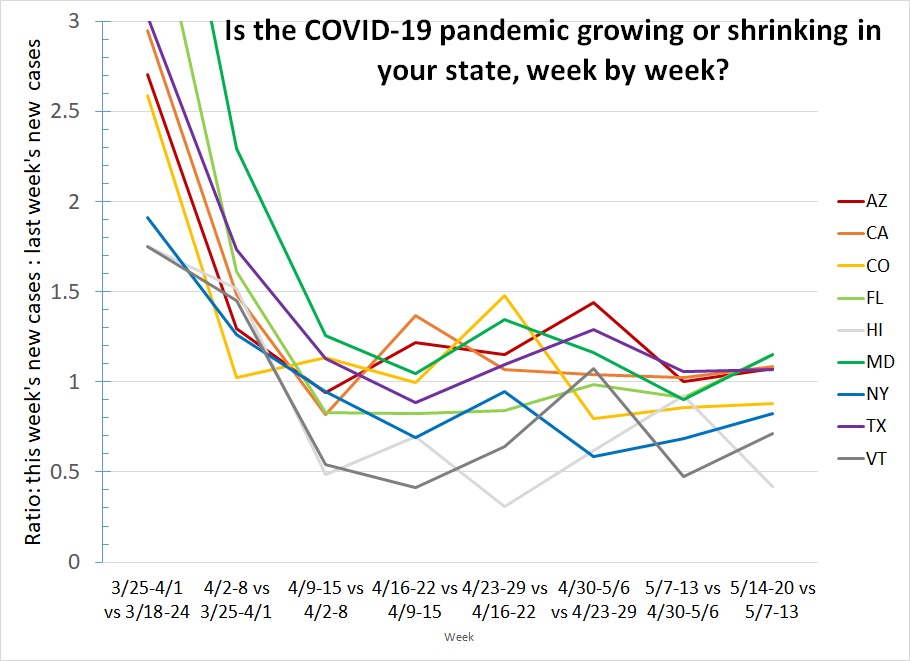
What do we learn from this graph?
- On the left side of the graph we see the virus was growing uncontrolled in March. Faster in some states than others (Hawaii at 1.75 was already benefiting from its isolation; Maryland and Florida are off the top of the chart at 4.9 and 3.8.)
- In most states, stay-at-home orders were in place by the end of March and stayed in place for a month: most states stayed achieved a ratio near 1 and stayed there.
- However, not every state maintained a ratio below 1, and that is what is necessary, in every state, to keep the situation getting better rather than worse. In particular, notice how Arizona, California, Maryland, and Texas have each only dipped below that critical level once.
- Florida typifies what we are most afraid of: they maintained a ratio below 1 for five weeks — then reopened just when they were starting to win the battle, and are back above 1 again this week for the first time since early April.
- New York and Vermont are doing what we want all states to do: they achieved a ratio below 1 back in April, and have maintained it. They were far enough below 1 in late April that they could do some modest easing of restrictions and stay below 1. Notice that both states' ratios rose in the most recent week, but didn't rise so far as to suggest either state is in danger of losing control of the epidemic a second time.
How is your state doing? If yours isn't on the graph, you can download a complete list and look. If your state is still below 1.00 even after easing some restrictions like New York has, great. Maybe Pennsylvania and Rhode Island can cautiously ease a little and keep a close eye to make sure nothing bad happens in the next two weeks.
If your state was doing well but isn't anymore, that means you might have gone too far with easing restrictions. Wyoming might be in for a very bad summer after removing their travel restrictions and allowing tourists from all over the country into Yellowstone Park again.
And finally, if your state has yet to maintain a ratio below 1.00, you have a problem, that's going to turn into an emergency if you don't fix it. If you live in Minnesota, North Carolina or Texas, you should be writing to your governor telling him you don't want him to reopen the state any more — he should have been doing a better job shutting it down!
Stay tuned for an update from me next week, and stay safe!