
Is reopening causing a resurgence of coronavirus in your state?
Gordon Bower
04-05 June 2020
This series of posts will be updated weekly until the virus crisis subsides in the US. Previous posts are available for comparison: 28 May and 21 May.
Introduction
Short answer: Yes. It's just a question of how soon and how fast. Before states started to reopen, only Alaska, Hawaii, Montana, and Vermont had it solidly under control. States that had the virus only barely under control in April have to be very careful how far towards "business as usual" they go, and it looks like most of them went too far.
The states like New York and New Jersey that had huge caseloads in March and April are still recovering. As the situation improves in those states, still under significant restrictions, people looking only at the national totals were given the impression the virus was under control everywhere. Unfortunately, not so: more states are on the way up than on the way down. In fact a few states have yet to everget the epidemic under control, and even those states opted to relax some restrictions and let the rate of infection accelerate.
I wrote before, in a longer and more technical article, about how the key to stopping the spread of an epidemic is to reduce the virus's reproduction number, R, below 1: If each contagious person infects an average of less than one healthy person, the spread of the disease grinds to a halt. If each contagious person infects more than one healthy person, the disease spreads faster and faster.
In the USA, the number of recorded cases rose very rapidly through the month of March. This was partly due to expanded testing capability, partly due to the virus's rapid spread. In April the virus's spread was slowed, and reasonable access to testing was established, in most states.
If you want to precisely model the spread of the virus, you need to take into account a lot of factors: how long it takes to become contagious, how many people are asymptomatic, how widely available testing is. Our purpose in this article isn't to get into that level of detail. To learn how detailed models work, you can go to rt.live and scroll to the "Learn More" links at the bottom of the page; read about what goes in to the Institute for Health Metrics and Evaluation's model; or read a fun little comic strip about pandemic modeling by Zach Weinersmith, the author of the Saturday Morning Breakfast Cereal daily comic.
What we're going to do here is talk about a simple and fairly stable way for you to keep tabs on how well your state is doing, without making you do a lot of math. Here's our simple shortcut:
- How many new cases did your state report this week?
- How many new cases did your state report last week?
- Divide the first by the second.
If the quotient is less than one, that is good: your number of cases is going down, and is likely to continue to go down about this same rate next week if nothing changes. If the quotient is greater than one, that is bad: your number of cases is going up and is likely to keep going up unless your state takes action to limit the spread.
We take weekly totals rather than daily totals for two reasons. First, this avoids hiccups in the data caused by what time of day a state updates its official tally, or fails to update it on a Sunday and has twice as many cases as usual to add on Monday. Second, the incubation time for the infection averages around five days (see this article for instance.) If you have symptoms, you may have spread the disease for a day or so before you first had symptoms; if you are asymptomatic you might spread the disease for several days after you contract it. One week corresponds very roughly to the average length of time elapsed between Person A testing positive and Person B testing positive after being infected by person A. This means that this quotient is a rough estimate of R — subject, of course, to all those extra factors about testing, how many asymptomatic carriers there are, and so on, that the people building complicated models are worrying about.
How is your state doing this week?
Here's a list of all 50 states, plus the District of Columbia and Puerto Rico, comparing new cases 28 May-03 June with new cases 21-27 May, sorted from best to worst. I will update this article with a new list each week; you can compare last week's version here. (The "trend" column is from a more complicated analysis to see if the increase or decrease in number of cases over this 14-day period was statistically significant. In states with low numbers of cases, or where the number of reported test varies wildly day to day, it may take more than 14 days to prove a trend is meaningful.)
| State | 28 May- 3 Jun | 21-27 May | Ratio | Trend |
|---|---|---|---|---|
| West Virginia | 178 | 332 | 0.54 | |
| Delaware | 616 | 902 | 0.68 | Decreasing |
| Illinois | 9524 | 13888 | 0.69 | Decreasing |
| Connecticut | 1668 | 2407 | 0.69 | |
| North Dakota | 240 | 344 | 0.70 | Decreasing |
| Iowa | 1931 | 2749 | 0.70 | |
| Minnesota | 3406 | 4794 | 0.71 | Decreasing |
| District of Columbia | 610 | 855 | 0.71 | |
| Wyoming | 55 | 73 | 0.75 | |
| Pennsylvania | 4223 | 5431 | 0.78 | Decreasing |
| Vermont | 19 | 24 | 0.79 | |
| Oklahoma | 576 | 697 | 0.83 | |
| Louisiana | 2633 | 3177 | 0.83 | |
| Ohio | 3353 | 4003 | 0.84 | Decreasing |
| South Dakota | 452 | 533 | 0.85 | |
| New York | 9120 | 10595 | 0.86 | Decreasing |
| Rhode Island | 866 | 997 | 0.87 | Decreasing |
| Georgia | 4256 | 4837 | 0.88 | |
| Maine | 281 | 318 | 0.88 | Decreasing |
| Virginia | 6152 | 6902 | 0.89 | |
| New Jersey | 5440 | 5852 | 0.93 | |
| Michigan | 2427 | 2599 | 0.93 | |
| Alabama | 2819 | 2980 | 0.95 | |
| New Mexico | 888 | 935 | 0.95 | |
| Wisconsin | 2938 | 3049 | 0.96 | |
| Nebraska | 1901 | 1862 | 1.02 | |
| Kansas | 801 | 784 | 1.02 | |
| Indiana | 3275 | 3163 | 1.04 | |
| Nevada | 801 | 762 | 1.05 | |
| Mississippi | 2272 | 2071 | 1.10 | |
| Missouri | 1251 | 1121 | 1.12 | |
| Maryland | 5812 | 5198 | 1.12 | |
| Colorado | 2292 | 1957 | 1.17 | |
| Puerto Rico | 626 | 531 | 1.18 | |
| Florida | 6130 | 5163 | 1.19 | |
| California | 18298 | 15053 | 1.22 | |
| New Hampshire | 509 | 418 | 1.22 | |
| South Carolina | 1792 | 1448 | 1.24 | |
| Idaho | 263 | 193 | 1.36 | |
| Tennessee | 3548 | 2599 | 1.37 | |
| North Carolina | 6360 | 4654 | 1.37 | |
| Massachusetts | 7372 | 5250 | 1.40 | |
| Arkansas | 1790 | 1274 | 1.41 | |
| Washington | 2078 | 1435 | 1.45 | |
| Kentucky | 1333 | 910 | 1.46 | |
| Texas | 10335 | 6869 | 1.50 | |
| Oregon | 361 | 237 | 1.52 | Increasing |
| Utah | 1791 | 996 | 1.80 | Increasing |
| Arizona | 5038 | 2412 | 2.09 | Increasing |
| Alaska | 93 | 10 | 9.30 | Increasing |
| Hawaii | 10 | 1 | 10.00 | |
| Montana | 44 | 3 | 14.67 | Increasing |
| Total | 150846 | 145646 | 1.04 | 5 up; 9 down |
What do we learn from this table?
This week's numbers are the first to reflect the impact of the Memorial Day and the start of summer travel season, as well as the relaxation of restrictions which mostly happened early in May. Some highlights:
- Most Northeastern states, hard-hit in April, are still recovering: Delaware and Connecticut join states like New York, New Jersey, and Pennsylvania near the top of the list.
- Maryland and Virginia having been hovering near level for the past month; the rapid acceleration of a month ago has slowed, but not conclusively been reversed.
- Minnesota has never before had a week with a decreasing number of cases. It's not clear to me whether they have made significant progress this week, or simply suffered a disruption in testing and reporting because of the protesting and rioting following George Floyd's death on May 25th.
- Many big states including California and Texas had large increases this week. If this continues, these large increases will outweigh the declines in Illinois and the Northeast and drive an increase in the national total in weeks to come.
- I noted last week that Arkansas appeared to be headed for trouble fast — and it continues to be headed there with another record-breaking week, and the number of cases doubling every 10 days to 2 weeks.
- Alaska and Montana have both suffered a series of small localized outbreaks in the past two weeks. Community spread has been confirmed in at least one Montana county. Both states are now seeing the same number of cases they saw in late March. Both states acted fast in late March and successfully stopped the disease in its tracks. They know how its done; to do it again, they need to act in the next week before the virus takes hold all over the state.
Are things better or worse now than they were a few weeks ago?
About the same.
This week saw half the states going up and half going down. That's not a receipe for gaining a victory over the disease anytime soon — especially as many of the states going down are still recovering from massive outbreaks earlier in the spring. Very few states are maintaining the disease at a low level.
The chart below shows the week-by-week history of these ratios in nine representative states:
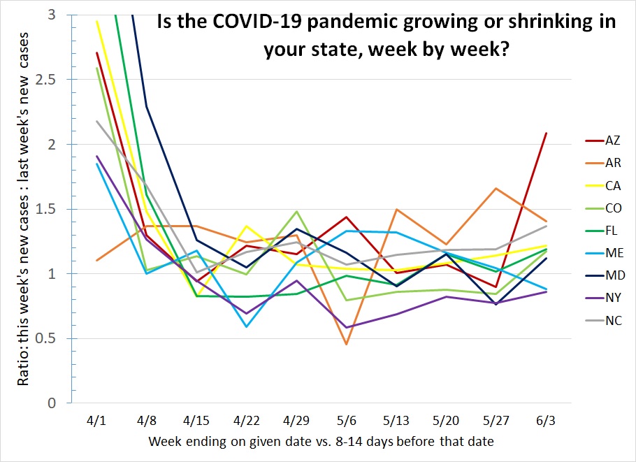
What do we learn from this graph?
- On the left side of the graph we see the virus was growing uncontrolled in March. Faster in some states than others (Hawaii at 1.75 was already benefiting from its isolation; Maryland and Florida are off the top of the chart at 4.9 and 3.8.)
- In most states, stay-at-home orders were in place by the end of March and stayed in place for a month: most states stayed achieved a ratio near 1 and stayed there through April.
- However, not every state maintained a ratio below 1.00, and that is what is necessary, in every state, to keep the situation getting better rather than worse. In particular, notice how Arizona and California have each only dipped below that critical level once.
- Florida typifies what we are most afraid of: they maintained a ratio below 1.00 for five weeks in April and early May, seemingly halting an impending disaster — then reopened just when they were starting to win the battle, and have been consistently above 1.00 three weeks in a row. Florida is now seeing daily caseloads as high as they saw in early April.
- Maryland was one of the states that had an bad April outbreak; they have been below 1.00 two of the last four weeks, but are not clearly winning the struggle yet.
- Colorado, with a surge around the same time as Maryland's, managed four weeks of steady declines. This week Colorado is back above 1.00; is it a one-time anomaly, or the onset of summer tourist season?
- Maine might be this week's success story. After suffering a resurgence for most of the month of May (just as Massachusetts peaked several weeks after New York did), their ratio has dropped 4 weeks in a row and finally fallen below 1.00 this week. Keep up the good work!
- North Carolina has never yet had a week with fewer cases than the week before. It's now experiencing 5 times as many infections per day as it was when the country shut down in March, and on track to double that rate every 2 or 3 weeks. (And despite this, President Trump demanded the state promise to fully reopen if it wanted to host the Republican National Convention in August; thankfully the governor refused to make a promise he couldn't keep.)
- Arkansas is a state that refused to impose a stay-at-home order, and maintained a ratio above 1.00 through April. The rate of infection has accelerated further and shows no signs of leveling off. In March, or in any other country, this kind of growth would prompt a strict lockdown. Why not here? Why not now?
- New York is doing what we want all states to do: they achieved a ratio below 1.00 back in April, and have maintained it. They were far enough below 1 in late April that they could do some modest easing of restrictions and stay below 1. Notice that the ratio rose a little in the last three weeks as restrictions began to ease, but remained below 1.
How is your state doing? If yours isn't on the graph, you can download a complete list and look. If your state is still below 1.00 even after easing some restrictions like New York, Pennsylvania and Rhode Island, great. Keep a close eye and make sure not to remove so many restrictions that progress halts.
If your state was doing well but isn't anymore, that means you might have gone too far with easing restrictions. Idaho and Missouri have had 3 weeks in a row of increases just like Florida has. Time to take social distancing seriously and regain control!
The start of tourist season might be very bad news, especially the wide-open spaces of the west. Montana, Alaska, Washington, Oregon, Colorado, and Utah have all just had their worst week in two months. I believe it was a grave mistake to lift the 14-day travel quarantine in my home state of Montana; any state that currently has a low infection rate compared to its neighbors should be looking hard at strictly limiting non-essential travel if it wishes to allow local business to reopen.
And finally, if your state has yet to maintain a ratio below 1.00, you have a problem, that's going to turn into an emergency if you don't fix it. If you live in a state showing consistent week-over-week rises — Arizona, Arkansas, California, Mississippi, North Carolina, Texas —, you should be writing to your governor telling him you don't want him to reopen the state any more. Now is the time to rein it in. It's better to close early and lock down hard for a relatively short time. If you let the infection rate get high, or you only take half-measures to control it, it takes far longer to regain control.
Stay tuned for an update from me next week, and stay safe!