
Is reopening causing a resurgence of coronavirus in your state?
Gordon Bower
28 May 2020
This series of posts will be updated weekly until the virus crisis subsides in the US. The current version and Last week's version are available for comparison.
Introduction
Short answer: Yes. It's just a question of how soon and how fast. Before states started to reopen, only Alaska, Hawaii, Montana, and Vermont had it solidly under control. A month into reopening, those are still the only states maintaining a consistently low level of cases, though there is hope that some of the states with large early outbreaks will soon join them. A few states have yet to everget the epidemic under control; many others had it only barely under control, and are very likely to tip themselves back intoR>1 territory as they ease restrictions on movement.
I wrote before, in a longer and more technical article, about how the key to stopping the spread of an epidemic is to reduce the virus's reproduction number, R, below 1: If each contagious person infects an average of less than one healthy person, the spread of the disease grinds to a halt. If each contagious person infects more than one healthy person, the disease spreads faster and faster.
In the USA, the number of recorded cases rose very rapidly through the month of March. This was partly due to expanded testing capability, partly due to the virus's rapid spread. In April the virus's spread was slowed, and reasonable access to testing was established, in most states.
If you want to precisely model the spread of the virus, you need to take into account a lot of factors: how long it takes to become contagious, how many people are asymptomatic, how widely available testing is. Our purpose in this article isn't to get into that level of detail. To learn how detailed models work, you can go to rt.live and scroll to the "Learn More" links at the bottom of the page; read about what goes in to the Institute for Health Metrics and Evaluation's model; or read a fun little comic strip about pandemic modeling by Zach Weinersmith, the author of the Saturday Morning Breakfast Cereal daily comic.
What we're going to do here is talk about a simple and fairly stable way for you to keep tabs on how well your state is doing, without making you do a lot of math. Here's our simple shortcut:
- How many new cases did your state report this week?
- How many new cases did your state report last week?
- Divide the first by the second.
If the quotient is less than one, that is good: your number of cases is going down, and is likely to continue to go down about this same rate next week if nothing changes. If the quotient is greater than one, that is bad: your number of cases is going up and is likely to keep going up unless your state takes action to limit the spread.
We take weekly totals rather than daily totals for two reasons. First, this avoids hiccups in the data caused by what time of day a state updates its official tally, or fails to update it on a Sunday and has twice as many cases as usual to add on Monday. Second, the incubation time for the infection averages around five days (see this article for instance.) If you have symptoms, you may have spread the disease for a day or so before you first had symptoms; if you are asymptomatic you might spread the disease for several days after you contract it. One week corresponds very roughly to the average length of time elapsed between Person A testing positive and Person B testing positive after being infected by person A. This means that this quotient is a rough estimate of R — subject, of course, to all those extra factors about testing, how many asymptomatic carriers there are, and so on, that the people building complicated models are worrying about.
How is your state doing this week?
Here's a list of all 50 states, plus the District of Columbia and Puerto Rico, that I made today, comparing new cases 21-27 May with new cases 14-20 May, sorted from best to worst. I will update this article with a new list each week. (View last week's version.) The "trend" column is from a more complicated analysis to see if the increase or decrease in number of cases over this 14-day period was statistically significant.
| State | 21-27 May | 14-20 May | Ratio | Trend |
|---|---|---|---|---|
| Montana | 3 | 16 | 0.19 | |
| Hawaii | 1 | 5 | 0.20 | |
| Connecticut | 2271 | 4162 | 0.55 | Decreasing |
| Alaska | 10 | 18 | 0.56 | |
| Michigan | 2599 | 4618 | 0.56 | Decreasing |
| Oregon | 237 | 385 | 0.62 | |
| Massachusetts | 5250 | 8473 | 0.62 | Decreasing |
| New Jersey | 5852 | 9216 | 0.63 | Decreasing |
| Rhode Island | 997 | 1521 | 0.66 | |
| Delaware | 902 | 1242 | 0.73 | Decreasing |
| New Hampshire | 418 | 569 | 0.73 | |
| Wyoming | 73 | 99 | 0.74 | |
| Maryland | 5198 | 6835 | 0.76 | Decreasing |
| North Dakota | 344 | 448 | 0.77 | |
| New York | 10595 | 13709 | 0.77 | Decreasing |
| Kansas | 784 | 989 | 0.79 | |
| Texas | 6869 | 8653 | 0.79 | |
| Kentucky | 910 | 1128 | 0.81 | |
| Indiana | 3163 | 3801 | 0.83 | Decreasing |
| Nevada | 762 | 912 | 0.84 | |
| Nebraska | 1862 | 2210 | 0.84 | |
| Colorado | 1957 | 2322 | 0.84 | Decreasing |
| Illinois | 13888 | 15724 | 0.88 | Decreasing |
| District of Columbia | 855 | 967 | 0.88 | |
| Arizona | 2412 | 2690 | 0.90 | |
| Pennsylvania | 5431 | 6025 | 0.90 | |
| Utah | 996 | 1090 | 0.91 | |
| New Mexico | 935 | 953 | 0.98 | |
| Washington | 1435 | 1459 | 0.98 | |
| Puerto Rico | 531 | 537 | 0.99 | |
| Minnesota | 4794 | 4753 | 1.01 | |
| Florida | 5163 | 5069 | 1.02 | |
| Oklahoma | 697 | 674 | 1.03 | |
| Maine | 318 | 304 | 1.05 | |
| Idaho | 193 | 184 | 1.05 | |
| Ohio | 4003 | 3715 | 1.08 | |
| Alabama | 2598 | 2352 | 1.10 | Increasing |
| Georgia | 4837 | 4374 | 1.11 | |
| Mississippi | 2071 | 1868 | 1.11 | |
| Tennessee | 2599 | 2317 | 1.12 | |
| California | 15053 | 13199 | 1.14 | |
| Missouri | 1121 | 978 | 1.15 | |
| Iowa | 2749 | 2331 | 1.18 | |
| Virginia | 6902 | 5801 | 1.19 | |
| North Carolina | 4654 | 3910 | 1.19 | |
| South Dakota | 533 | 445 | 1.20 | |
| Louisiana | 3177 | 2652 | 1.20 | |
| Wisconsin | 3049 | 2511 | 1.21 | |
| South Carolina | 1448 | 1145 | 1.26 | |
| Vermont | 24 | 18 | 1.33 | |
| Arkansas | 1274 | 767 | 1.66 | |
| West Virginia | 332 | 169 | 1.96 | |
| Total | 145129 | 160312 | 0.91 | 1 up; 10 down |
What do we learn from this table?
- Overall this week's numbers are surprisingly good; while it is too early for Memorial Day Weekend and the start of summer tourist season to show up, it's encouraging that many people have taken it on themselves to remain safe and self-isolate even if they are allowed to go out.
- Hawaii has maintained its restrictions on tourism from the Mainland, and continues to enjoy a steady decline in cases.
- Connecticut and Massachusetts are continuing to come down from their serious outbreaks, which began later than New York. Last week it was not clear both states were still on a downward trajectory.
- States like Oregon and New York are still maintaining strong shutdown measures, and are still enjoying a steady decline in cases.
- States like Colorado and Washington have eased more restrictions but so far are keeping the situation under control.
- California, Maine, Minnesota, and North Carolina continue their slow unchecked upward trajectory. These states currently view their situation as manageable — hospitals aren't overwhelmed yet — but I think it's cause for serious concern that nothing is being done to reverse the trend.
- Arkansas has also had growth in number of cases for 8 of the last 9 weeks. They never imposed some of the restrictions other states did — and unlike North Carolina, they may be heading for serious trouble fast, if they allow the number of cases to double again in the next 10 days.
Are things better or worse now than they were a few weeks ago?
About the same.
This week was a good week, with only 21 states showing ratios above 1.00. I hope that's not just a lucky anomaly. This was only the second week (the other was May 8-13) in the past two months that more than half of states reported declines. If we want to only hear about 100 deaths per day instead of 1000 per day on the evening news, we need about six weeks in a row of solid progress.
The chart below shows the week-by-week history of these ratios in nine representative states:
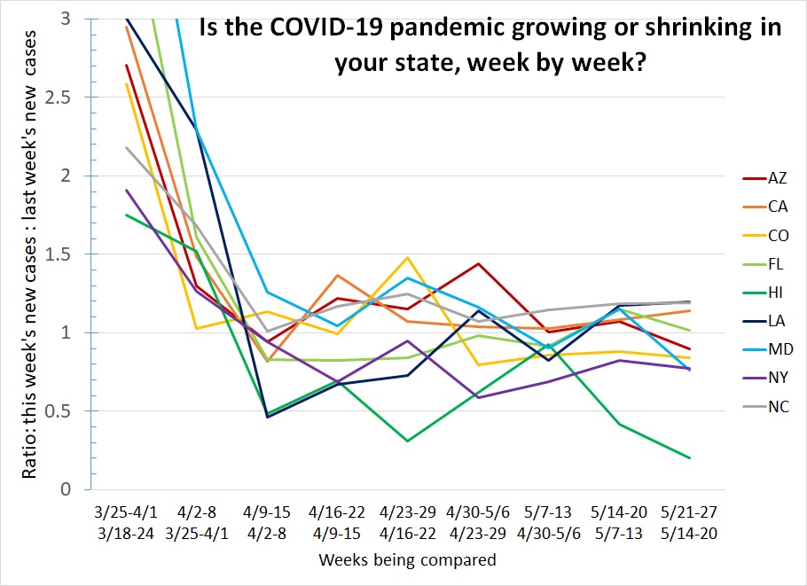
What do we learn from this graph?
- On the left side of the graph we see the virus was growing uncontrolled in March. Faster in some states than others (Hawaii at 1.75 was already benefiting from its isolation; Maryland and Florida are off the top of the chart at 4.9 and 3.8.)
- In most states, stay-at-home orders were in place by the end of March and stayed in place for a month: most states stayed achieved a ratio near 1 and stayed there through April.
- However, not every state maintained a ratio below 1.00, and that is what is necessary, in every state, to keep the situation getting better rather than worse. In particular, notice how Arizona and California have each only dipped below that critical level once.
- Florida typifies what we are most afraid of: they maintained a ratio below 1.00 for five weeks — then reopened just when they were starting to win the battle, and are back above 1 again the last two weeks, for the first time since early April. Louisiana is in essentially the same boat.
- Maryland may finally be coming down from its late first peak: three weeks ago it had its first week below 1.00 ever, then relapsed last week, and is again below 1 this week. Fingers crossed they can keep it there.
- Colorado, with a surge around the same time as Maryland's, has managed four weeks of steady declines.
- North Carolina has never yet had a week with fewer cases than the week before. (And despite this, President Trump demanded the state promise to fully reopen or he would try to move the Republican Convention scheduled for August to a state that would.)
- New York is doing what we want all states to do: they achieved a ratio below 1.00 back in April, and have maintained it. They were far enough below 1 in late April that they could do some modest easing of restrictions and stay below 1. Notice that the ratio rose a little in the most recent two weeks, but remained below 1.
How is your state doing? If yours isn't on the graph, you can download a complete list and look. If your state is still below 1.00 even after easing some restrictions like New York has, great. Maybe Pennsylvania and Rhode Island can cautiously ease a little and keep a close eye to make sure nothing bad happens in the next two weeks.
If your state was doing well but isn't anymore, that means you might have gone too far with easing restrictions. Wyoming might be in for a very bad summer after removing their travel restrictions and allowing tourists from all over the country into Yellowstone Park again.
And finally, if your state has yet to maintain a ratio below 1.00, you have a problem, that's going to turn into an emergency if you don't fix it. If you live in a state showing consistent week-over-week rises like Alabama, Arkansas, Maine, Minnesota, and North Carolina, you should be writing to your governor telling him you don't want him to reopen the state any more — he needs to do a better job shutting it down!
Stay tuned for an update from me next week, and stay safe!